代码之家  ›  专栏  ›  技术社区  ›  jean-max

矩形中的菱形HTML和CSS3

  •  1
  • jean-max  · 技术社区  · 7 年前

    我想做一个长方形的钻石。我已经用方块做过了:

    .box {
      width:100px;
      height:100px;
      background:orange;
      z-index:1;
      position:relative;  
    }
    
    .box:before {
      position:absolute;
      content:'';
      width:70.71%;
      height:70.71%;
      transform: rotate(45deg);
      background: red;
      top: 15%;
      left: 15%;
    }
    <div class="box"></div>

    但我想这样做:

    enter image description here

    矩形具有响应性,因此它的大小永远不会相同。有什么想法吗?

    谢谢

    2 回复  |  直到 7 年前
        1
  •  2
  •   sol    7 年前

    这种方法使用CSS生成的两个三角形 border .

    我觉得你不能用 % 对于 边境 宽度,因此我使用了视口单位。

    .box {
      width: 50vw;
      height: 25vw;
      background: orange;
      z-index: 1;
      position: relative;
    }
    
    .box:before,
    .box:after {
      content: '';
      position: absolute;
      width: 0;
      height: 0;
    }
    
    .box:before {
      border-right: solid 25vw red;
      border-top: solid 12.5vw transparent;
      border-bottom: solid 12.5vw transparent;
    }
    
    .box:after {
      right: 0;
      border-left: solid 25vw red;
      border-top: solid 12.5vw transparent;
      border-bottom: solid 12.5vw transparent;
    }
    <div class="box"></div>
        2
  •  1
  •   tao    7 年前

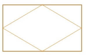
    您试图通过修改矩形来创建菱形。如果你用一个纸矩形试一下,你就会明白这不是最简单的方法。

    你可以使用 clip-path :

    .diamond {
      background-color: #eee;
      -webkit-clip-path: polygon(50% 0%, 100% 50%, 50% 100%, 0% 50%);
              clip-path: polygon(50% 0%, 100% 50%, 50% 100%, 0% 50%);
      margin: 0 auto;
      text-align: center;
      padding: 2rem;
    }
    <div class="diamond">I'm a diamond</div>

    ... 剩下的就是设置它的宽度、高度(或 min-* / max-* 对于其中任何一种),以响应地控制其比例。

    Do note CSS 剪辑路径 当前为 supported 只有约88%的活跃浏览器缺乏IE和Edge的支持。

    如果您需要这些支持,唯一的方法是使用两个级别的包装器并从 ::before ::after 那些包装纸的赝品。