我猜,作为一个
极其
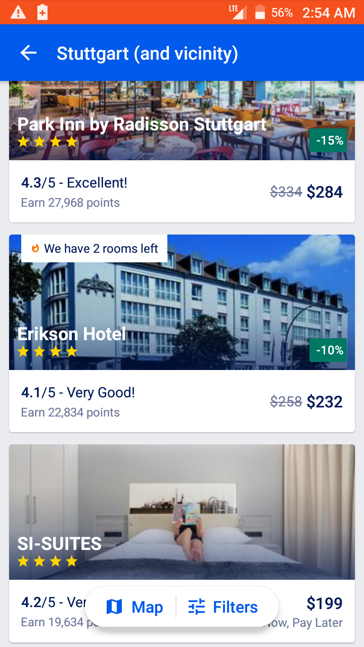
您可以使用
FrameLayout
(或精神亚类)
CoordinatorLayout
)来主持你的主要内容视图,然后你的“按钮”视图组在上面。
CardView
是在所有Android API级别上获得圆角和提升的好方法:
<?xml version="1.0" encoding="utf-8"?>
<FrameLayout
    xmlns:android="http://schemas.android.com/apk/res/android"
    xmlns:app="http://schemas.android.com/apk/res-auto"
    android:layout_width="match_parent"
    android:layout_height="match_parent">

    <!-- insert your content here -->

    <android.support.v7.widget.CardView
        android:layout_width="wrap_content"
        android:layout_height="48dp"
        android:layout_marginBottom="32dp"
        android:layout_gravity="center_horizontal|bottom"
        app:cardCornerRadius="24dp"
        app:cardElevation="8dp">

        <LinearLayout
            android:layout_width="wrap_content"
            android:layout_height="48dp"
            android:paddingLeft="12dp"
            android:paddingRight="12dp"
            android:orientation="horizontal">

            <TextView
                android:layout_width="wrap_content"
                android:layout_height="match_parent"
                android:padding="12dp"
                android:gravity="center"
                android:drawableStart="@drawable/icon_map"
                android:drawablePadding="6dp"
                android:textColor="#00f"
                android:textSize="18sp"
                android:text="@string/label_map"
                android:fontFamily="sans-serif-medium"/>

            <View
                android:layout_width="1dp"
                android:layout_height="match_parent"
                android:layout_marginTop="12dp"
                android:layout_marginBottom="12dp"
                android:background="#ccc"/>

            <TextView
                android:layout_width="wrap_content"
                android:layout_height="match_parent"
                android:padding="12dp"
                android:gravity="center"
                android:drawableStart="@drawable/icon_filters"
                android:drawablePadding="6dp"
                android:textColor="#00f"
                android:textSize="18sp"
                android:text="@string/label_filters"
                android:fontFamily="sans-serif-medium"/>

        </LinearLayout>

    </android.support.v7.widget.CardView>

</FrameLayout>
