代码之家  ›  专栏  ›  技术社区  ›  Colin Ricardo

将DIV拉伸到父级的高度

  •  -1
  • Colin Ricardo  · 技术社区  · 6 年前

    我知道这个问题的一些变化已经被问过很多次了。

    但是,我似乎无法使用推荐的方法来实现这一点。

    为什么是 flex: 1 似乎被忽视了?

    目的是让红色容器填满其下方的可用空间。

    代码沙盒链接 here .

    import React from "react";
    import { render } from "react-dom";
    import styled, { createGlobalStyle, ThemeProvider } from "styled-components";
    
    const Style = createGlobalStyle`
      body, html {
        height: 100%;
        background: green;
        margin: 0;
        padding: 0;
        overflow-x: hidden;
        overflow-y: auto;
      }
    `;
    
    const FlexCol = styled.div`
      display: flex;
      flex-direction: column;
    `;
    
    const Layout = ({ children }) => {
      return (
        <div>
          <Header>header</Header>
          <FlexCol>{children}</FlexCol>
        </div>
      );
    };
    
    const Header = styled.div`
      height: 50;
      background: blue;
    `;
    
    const Home = () => {
      return (
        <div>
          <Feed />
        </div>
      );
    };
    
    const FeedContainer = styled.div`
      display: flex;
      flex-direction: column;
      flex: 1;
      background: red;
    `;
    
    const Feed = () => <FeedContainer>something</FeedContainer>;
    
    const App = () => {
      return (
        <Layout>
          <Home />
        </Layout>
      );
    };
    
    render(
      <ThemeProvider theme={{}}>
        <React.Fragment>
          <Style />
          <App />
        </React.Fragment>
      </ThemeProvider>,
      document.getElementById("root")
    );
    

    enter image description here

    2 回复  |  直到 6 年前
        1
  •  0
  •   Gleb Kostyunin    6 年前

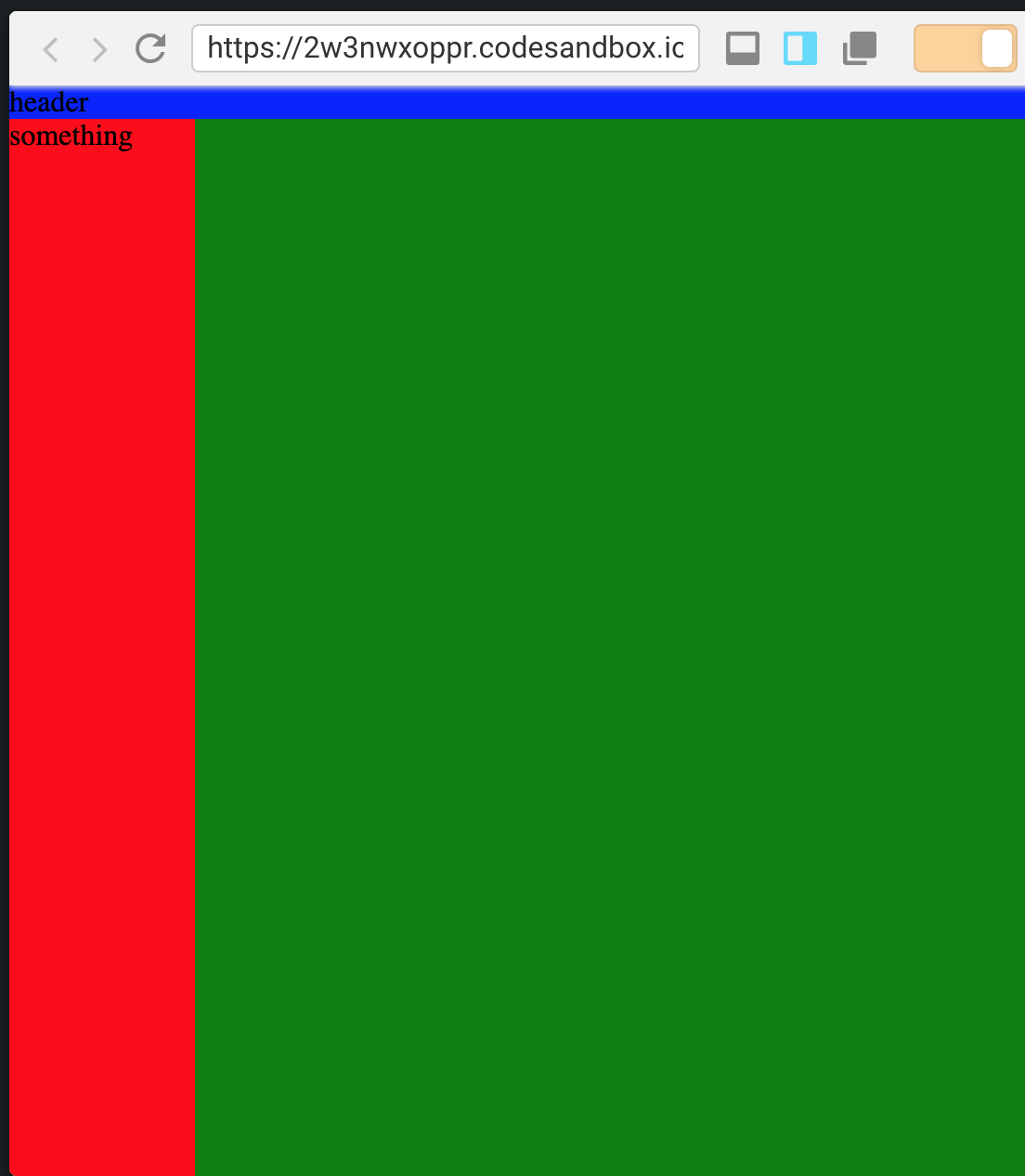
    设置中缺少的是主体和布局之间中间容器的高度。呈现React应用程序的容器:根。

    增加100%的高度可以解决问题:

    const Style = createGlobalStyle`
      body, html {
        height: 100%;
        background: green;
        margin: 0;
        padding: 0;
        overflow-x: hidden;
        overflow-y: auto;
      }
      #root { //<-- this thingie
        height: 100%;
      }
    `;
    

    这里有一个更新的沙盒: https://codesandbox.io/s/xrw84wkw54

        2
  •  0
  •   Colin Ricardo    6 年前

    为了将来参考,也可以通过设置 Layout 并使用 flexGrow 相关的地方。

    import React from "react";
    import { render } from "react-dom";
    import styled, { createGlobalStyle, ThemeProvider } from "styled-components";
    
    const Style = createGlobalStyle`
      body, html {
        height: 100%;
        background: green;
        margin: 0;
        padding: 0;
        overflow-x: hidden;
        overflow-y: auto;
      }
    `;
    
    const FlexCol = styled.div`
      display: flex;
      flex-direction: column;
      flex-grow: 1;
    `;
    
    const Layout = ({ children }) => {
      return (
        <div style={{ height: "100vh", display: "flex", flexDirection: "column" }}>
          <Header>header</Header>
          <FlexCol>{children}</FlexCol>
        </div>
      );
    };
    
    const Header = styled.div`
      height: 50;
      background: blue;
    `;
    
    const Home = () => {
      return (
        <div
          style={{
            height: "100%"
          }}
        >
          <Feed />
        </div>
      );
    };
    
    const FeedContainer = styled.div`
      display: flex;
      flex: 1;
      background: red;
      height: 100%;
      width: 100px;
    `;
    
    const Feed = () => <FeedContainer>something</FeedContainer>;
    
    const App = () => {
      return (
        <Layout>
          <Home />
        </Layout>
      );
    };
    
    render(
      <ThemeProvider theme={{}}>
        <React.Fragment>
          <Style />
          <App />
        </React.Fragment>
      </ThemeProvider>,
      document.getElementById("root")
    );
    

    这给出:

    enter image description here