代码之家  ›  专栏  ›  技术社区  ›  dnagirl

用R.zoo绘制带误差条的多序列

  •  4
  • dnagirl  · 技术社区  · 16 年前

    我有这样的数据:

       > head(data)
                 groupname ob_time dist.mean  dist.sd dur.mean   dur.sd   ct.mean    ct.sd
          1      rowA     0.3  61.67500 39.76515 43.67500 26.35027  8.666667 11.29226
          2      rowA    60.0  45.49167 38.30301 37.58333 27.98207  8.750000 12.46176
          3      rowA   120.0  50.22500 35.89708 40.40000 24.93399  8.000000 10.23363
          4      rowA   180.0  54.05000 41.43919 37.98333 28.03562  8.750000 11.97061
          5      rowA   240.0  51.97500 41.75498 35.60000 25.68243 28.583333 46.14692
          6      rowA   300.0  45.50833 43.10160 32.20833 27.37990 12.833333 14.21800
    

    每个组名都是一个数据系列。因为我想分别绘制每个系列,所以我将它们分开如下:

    > A <- zoo(data[which(groupname=='rowA'),3:8],data[which(groupname=='rowA'),2])
    > B <- zoo(data[which(groupname=='rowB'),3:8],data[which(groupname=='rowB'),2])
    > C <- zoo(data[which(groupname=='rowC'),3:8],data[which(groupname=='rowC'),2])
    

    预计到达时间:

    Thanks to gd047: Now I'm using this:
    
        z <- dlply(data,.(groupname),function(x) zoo(x[,3:8],x[,2]))
    

    > head(z$rowA)
              dist.mean  dist.sd dur.mean   dur.sd   ct.mean    ct.sd
         0.3  61.67500 39.76515 43.67500 26.35027  8.666667 11.29226
         60   45.49167 38.30301 37.58333 27.98207  8.750000 12.46176
         120  50.22500 35.89708 40.40000 24.93399  8.000000 10.23363
         180  54.05000 41.43919 37.98333 28.03562  8.750000 11.97061
         240  51.97500 41.75498 35.60000 25.68243 28.583333 46.14692
         300  45.50833 43.10160 32.20833 27.37990 12.833333 14.21800
    

    因此,如果我想绘制dist.mean与时间的关系图,并为每个序列包含等于+/-dist.sd的误差线:

    • 如何组合A、B、C dist.mean和dist.sd?
    • 如何绘制条形图, ,结果对象的折线图?
    4 回复  |  直到 16 年前
        1
  •  3
  •   Yorgos    16 年前

    我看不出把数据分成三部分只需要把它们组合在一起就可以得到一个图有什么意义。下面是一个使用 ggplot2 图书馆:

    library(ggplot2)
    qplot(ob_time, dist.mean, data=data, colour=groupname, geom=c("line","point")) + 
      geom_errorbar(aes(ymin=dist.mean-dist.sd, ymax=dist.mean+dist.sd))
    

    scale_x_continuous 定义实际时间值的记号。让它们等距排列更为棘手:你可以转换 ob_time qplot 拒绝用线连接点。

    解决方案1-条形图:

    qplot(factor(ob_time), dist.mean, data=data, geom=c("bar"), fill=groupname, 
          colour=groupname, position="dodge") + 
    geom_errorbar(aes(ymin=dist.mean-dist.sd, ymax=dist.mean+dist.sd), position="dodge")
    

    qplot(factor(ob_time), dist.mean, data=data, geom=c("line","point"), colour=groupname) +
      geom_errorbar(aes(ymin=dist.mean-dist.sd, ymax=dist.mean+dist.sd)) + 
      geom_line(aes(x=as.numeric(factor(ob_time))))
    
        2
  •  3
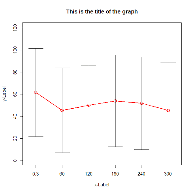
  •   Community Mohan Dere    9 年前

    g <- (nrow(data)-1)/(3*nrow(data))
    
    plot(data[,"dist.mean"],col=2, type='o',lwd=2,cex=1.5, main="This is the title of the graph",
     xlab="x-Label", ylab="y-Label", xaxt="n",
     ylim=c(0,max(data[,"dist.mean"])+max(data[,"dist.sd"])),
     xlim=c(1-g,nrow(data)+g))
    axis(side=1,at=c(1:nrow(data)),labels=data[,"ob_time"])
    
    for (i in 1:nrow(data)) {
    lines(c(i,i),c(data[i,"dist.mean"]+data[i,"dist.sd"],data[i,"dist.mean"]-data[i,"dist.sd"]))
    lines(c(i-g,i+g),c(data[i,"dist.mean"]+data[i,"dist.sd"], data[i,"dist.mean"]+data[i,"dist.sd"]))
    lines(c(i-g,i+g),c(data[i,"dist.mean"]-data[i,"dist.sd"], data[i,"dist.mean"]-data[i,"dist.sd"]))
    }
    

    alt text

        3
  •  3
  •   G. Grothendieck    16 年前

    使用Read.zoo和split=参数读取中的数据,按groupname对其进行拆分。然后把dist、lower和upper线绑在一起。最后,我要画出来。

    Lines <- "groupname ob_time dist.mean  dist.sd dur.mean   dur.sd   ct.mean    ct.sd
    rowA     0.3  61.67500 39.76515 43.67500 26.35027  8.666667 11.29226
    rowA    60.0  45.49167 38.30301 37.58333 27.98207  8.750000 12.46176
    rowA   120.0  50.22500 35.89708 40.40000 24.93399  8.000000 10.23363
    rowA   180.0  54.05000 41.43919 37.98333 28.03562  8.750000 11.97061
    rowB   240.0  51.97500 41.75498 35.60000 25.68243 28.583333 46.14692
    rowB   300.0  45.50833 43.10160 32.20833 27.37990 12.833333 14.21800"
    
    library(zoo)
    # next line is only needed until next version of zoo is released
    source("http://r-forge.r-project.org/scm/viewvc.php/*checkout*/pkg/zoo/R/read.zoo.R?revision=719&root=zoo")
    z <- read.zoo(textConnection(Lines), header = TRUE, split = 1, index = 2)
    
    # pick out the dist and sd columns binding dist with lower & upper 
    z.dist <- z[, grep("dist.mean", colnames(z))]
    z.sd <- z[, grep("dist.sd", colnames(z))]
    zz <- cbind(z = z.dist, lower = z.dist - z.sd, upper = z.dist + z.sd)
    
    # plot using N panels
    N <- ncol(z.dist)
    ylab <- sub("dist.mean.", "", colnames(z.dist))
    plot(zz, screen = 1:N, type = "l", lty = rep(1:2, N*1:2), ylab = ylab)
    
        4
  •  2
  •   Glorfindel Doug L.    7 年前

    一个选择是 segplot latticeExtra函数

    library(latticeExtra)
    segplot(ob_time ~ (dist.mean + dist.sd) + (dist.mean - dist.sd) | groupname, 
        data = data, centers = dist.mean, horizontal = FALSE)
    ## and with the latest version of latticeExtra (from R-forge):
    trellis.last.object(segments.fun = panel.arrows, ends = "both", angle = 90, length = .1) +
        xyplot(dist.mean ~ ob_time | groupname, data, col = "black", type = "l")
    

    使用Gabor可重现的数据集,这将产生:

    segplot