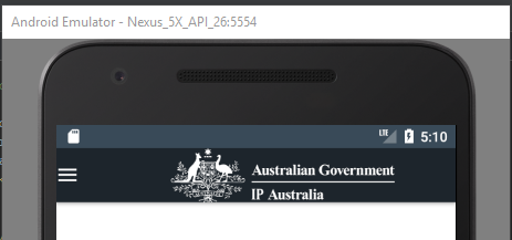
ActionBarDrawerToggle
将其切换图标设置为
ActionBar
的导航按钮。在一个
AppCompatActivity
这个
实际上是一个
Toolbar
下面,导航按钮的样式为
style
主题上的资源集
toolbarNavigationButtonStyle
属性
在你的主题中,你设置了一个
color
资源,而不是
默认样式中的所有值都将丢失,包括
minWidth
值,这就是为什么您的切换被包装到可绘制的宽度。
如果要修改导航按钮上的某些样式值,则应创建自己的样式值
风格
资源,默认为
风格
作为其
parent
,在那里设置所需的属性,并指定
风格
作为你的主题
工具栏导航按钮样式
. 例如:
<style name="AppTheme" parent="Theme.AppCompat.Light.DarkActionBar">
    ...
    <item name="toolbarNavigationButtonStyle">@style/Toolbar.Button.Navigation</item>
</style>

<style name="Toolbar.Button.Navigation" parent="Widget.AppCompat.Toolbar.Button.Navigation">
    <item name="android:background">@color/ipGreen</item>
</style>
如果你实际上想修改的是汉堡包箭头,它有自己的风格,你可以“子风格”,并改变其中的某些功能。例如:
<style name="AppTheme" parent="Theme.AppCompat.Light.DarkActionBar">
    ...
    <item name="drawerArrowStyle">@style/DrawerArrowToggle</item>
</style>

<style name="DrawerArrowToggle" parent="Widget.AppCompat.DrawerArrowToggle">
    <item name="color">@color/ipGreen</item>
</style>
以下是可在中修改的属性的完整列表
drawerArrowStyle
,如果要自定义其任何其他属性。
<!-- The drawing color for the bars -->
<attr name="color" format="color"/>
<!-- Whether bars should rotate or not during transition -->
<attr name="spinBars" format="boolean"/>
<!-- The total size of the drawable -->
<attr name="drawableSize" format="dimension"/>
<!-- The max gap between the bars when they are parallel to each other -->
<attr name="gapBetweenBars" format="dimension"/>
<!-- The length of the arrow head when formed to make an arrow -->
<attr name="arrowHeadLength" format="dimension"/>
<!-- The length of the shaft when formed to make an arrow -->
<attr name="arrowShaftLength" format="dimension"/>
<!-- The length of the bars when they are parallel to each other -->
<attr name="barLength" format="dimension"/>
<!-- The thickness (stroke size) for the bar paint -->
<attr name="thickness" format="dimension"/>