代码之家  ›  专栏  ›  技术社区  ›  leemes

在一个背景CSS属性中组合背景颜色和渐变

  •  2
  • leemes  · 技术社区  · 8 年前

    background background-position background-size

    div {
        width: 400px; height: 200px; border: 1px solid gray;
        
        background: red, linear-gradient(to right, black, white);
        background-position: left, right;
        background-size: 70% 100%, 30% 100%;
        background-repeat: no-repeat;
    }
    <div></div>

    我希望这样:

    enter image description here

    然而,Chrome表示background属性的值无效:

    enter image description here

    我不明白为什么。

    (在本例中是可能的)原因有两个:

    • 位置/大小应在过渡中设置动画(悬停时应更改70%/30%的比率),这不能通过单梯度停止来完成。

    我目前的工作是用相同的开始和结束颜色将纯色包裹在渐变中,我不相信这在这里真的是必要的。有点难看,我相信有一个更简单的方法。。。

    3 回复  |  直到 8 年前
        1
  •  3
  •   G-Cyrillus    8 年前

    linear-gradient() 就像 url() ,一个图像( background-image background-color ) <edit> 可以通过设置多个渐变并设置动画 background-size

    div {
      width: 400px;
      height: 200px;
      border: 1px solid gray;   
      background:linear-gradient(to top,red,red) no-repeat, linear-gradient(to right,black, white) no-repeat  100% 0 tomato; 
      background-size: 20% auto, 80% auto;
      animation: animate 4s infinite alternate;
    }
    @keyframes animate {
    from {  background-size: 20% auto, 80% auto;}
    30% {  background-size: 10% auto, 10% auto;}
    90%, to {  background-size: 70% auto, 30% auto;}
    }
    <div>
    
    </div>

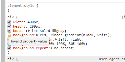
    请注意,红色可以包括在渐变中,而不是使用背景色: https://developer.mozilla.org/en-US/docs/Web/CSS/linear-gradient

    CSS函数在两种或更多颜色之间创建线性渐进过渡。其结果是 <gradient> <image>

    div {
      width: 400px;
      height: 200px;
      border: 1px solid gray; 
      background: linear-gradient(to right, red 70%,black 70%, white) ;
    }
    <div>
    

    https://developer.mozilla.org/en-US/docs/Web/CSS/background

    CSS background 速记属性允许您一次调整所有可用的背景样式选项,包括彩色图像、原点和大小、重复方法和其他功能。 出身背景 可用于设置以下一项或多项的值: background-clip 背景色 , background-origin , background-position background-repeat , background-attachment .

        2
  •  2
  •   BoltClock    8 年前

    颜色值只能出现在具有分层背景的元素的最后一层中,如中所述 spec . 您正在非最后一个图层中指定颜色,这会导致速记声明无效。

        3
  •  1
  •   Will Eizlini    8 年前

    设置背景渐变将覆盖在背景色上。 因此,如果你只希望屏幕的70%是红色的,你需要像以前一样将其包括在渐变中。

    您的属性没有在js fiddle中呈现的原因是,您使用了一个逗号来分隔反循环速记属性的不同部分。因此,如果您确实希望在背景上覆盖渐变,则需要删除逗号:

    div {
    
    /* other properties of the div here */
    
    background: red linear-gradient(to right, transparent 0%, transparent 70%, rgb(0,0,0) 70%,rgb(255,255,255) 100%);
    
    }
    

    https://jsfiddle.net/0orbjebm/

    div {
    
      /* other properties of the div here */
    
      background: red linear-gradient(to right, transparent 0%, transparent 70%, rgba(0,0,0,1) 100%);
    
    }
    

    https://jsfiddle.net/tootz4w8/

    <div>
    <!-- this one will be red and fade to black -->
    </div>
    
    <div style="background-color:blue">
    <!-- this one will be blue and fade to black -->
    </div>