代码之家  ›  专栏  ›  技术社区  ›  Return-1

内div,带平方比和flexbox[副本]

  •  0
  • Return-1  · 技术社区  · 7 年前

    这个问题已经有了答案:

    我试图实现以下目标:

    enter image description here

    其中蓝色框的高度可变,黄色框的高度始终为蓝色框的50%。

    使用Flex相当简单

    <div style="display:flex;align-items:center">
        <div id="yellow" style="height:50%">
        </div>
    </div>
    

    问题是,我试图保持一个特定的比例,在这种情况下平方内框。我该如何处理?


    加分:

    • 我通常如何指定比率?有没有一个解决方案不仅适用于1:1而且适用于任何x:y?
    • 如果不使用flexbox,而潜在的目标仍然是?

    额外信息:蓝色的盒子总是比上面的宽,想一个按钮。

    5 回复  |  直到 7 年前
        1
  •  2
  •   vals    7 年前

    与temani afif提供的答案类似,但使用svg而不是图像(因此不需要额外的请求)。

    而且,它更容易适应任意长宽比

    .container {
      height: 150px;
      background-color: lightblue;
      display: flex;
      align-items: center;
      justify-content: center;
      margin: 10px;
    }
    
    .aspectRatio {
      display: grid;
      background-color: yellow;
      height: 50%;
    }
    .aspectRatio svg {
      height: 100%;
      border: solid 1px red;
      animation: resize 1s infinite;
    }
    .aspectRatio > * {
      grid-area: 1 / 1 / 2 / 2;
    }
    
    @keyframes resize {
      from {height: 100%;}
      to {height: 99.9%;}
    }
    <div class="container">
      <div class="aspectRatio">
        <svg viewBox="0 0 1 1"></svg>
        <div class="inner">square</div>
      </div>
    </div>
    <div class="container">
      <div class="aspectRatio">
        <svg viewBox="0 0 4 3"></svg>
        <div class="inner">ratio 4/3</div>
      </div>
    </div>
        2
  •  3
  •   Temani Afif    7 年前

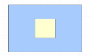
    我不认为有一种方法可以使用高度来定义宽度(即使我们可以使用一些诡计类似的填充物来做相反的操作),但是一个想法是依靠一个正方形的图像来保持比例。然后,内容应该被定位:

    #blue {
      display: flex;
      align-items: center;
      justify-content:center;
      height:80vh;
      background: blue;
    }
    
    #yellow {
      height: 50%;
      background: yellow;
      position:relative;
    }
    img {
     max-height:100%;
     visibility:hidden;
    }
    #yellow .content {
      position:absolute;
      top:0;
      right:0;
      left:0;
      bottom:0;
    }
    <div id="blue" >
      <div id="yellow" >
        <img src="https://picsum.photos/500/500?image=1069" >
        <div class="content">Some content here</div>
      </div>
    </div>

    但是如果蓝色的高度是一个固定值,最好依赖css变量,如下所示:

    #blue {
      display: flex;
      align-items: center;
      justify-content:center;
      --h:80vh;
      height:var(--h);
      background: blue;
    }
    
    #yellow {
      height: calc(var(--h) / 2);
      width:calc(var(--h) / 2);
      background: yellow;
      position:relative;
    }
    <div id="blue" >
      <div id="yellow" >
        <div class="content">Some content here</div>
      </div>
    </div>
        3
  •  0
  •   Zuber    7 年前

    看看这能不能帮到你,

    .outer {
        background-color: lightblue;
        height: 100px; /* Change as per your requirement */
        display: flex;
        align-items: center;
        justify-content: center;
        max-width: 200px; /* You can Remove this */
    }
    .inner {
        background-color: lightyellow;
        height: 50%;
        width: 50px;
    }
    <div style="" class="outer">
    
    <div id="yellow" class="inner">
    </div>
    
    </div>
        4
  •  0
  •   FelipeAls    7 年前

    如果旋转90度,就有可能:)

    • 父对象的可变宽度和高度(以及比率)
    • 孩子总是比父母高50%。
    • 和一个正方形

    如果它想因为转换而附加到其他内容。

    –_ Codepen

    .flex {
      display: table-cell; /* allows "vertical" centering (not possible with flex/grid here because of the padding-top trick on child) */
      width: 12rem;
      height: 20rem;
      vertical-align: middle; /* "vertical" centering */
      transform: rotate(90deg) translateY(-50%); /* vertical becomes horizontal */
      background-color: lightblue;
    }
    
    .flex.large {
      height: 35rem;
    }
    
    .item {
      width: 50%;
      height: 0;
      margin-left: 25%; /* "horizontal" centering */
      padding-top: 50%; /* padding-top trick for a square */
      background-color: lightyellow;
    }
    <div class="flex">
      <div class="item"></div>
    </div>
    
    <hr>
    
    <div class="flex large">
      <div class="item"></div>
    </div>
        5
  •  -1
  •   Bibek    7 年前

    如果它能帮到你,试试这个。

         .outerdiv 
         {
         background-color: lightblue;
         height: 100px;
         display: grid;
         align-items: center;
         }
         .innerdiv 
         {
         background-color: lightyellow;
         height: 50%;
         width: 50px;
         margin:0 auto;
         }
         <div style="" class="outerdiv"> 
         <div id="yellow" class="innerdiv"></div>
         </div>