因此,浏览器兼容性有点问题,但仅适用于iPhone和iPad Safari浏览器:(
网站:
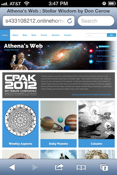
http://s433108212.onlinehome.us
我的客户希望页眉中的空格背景延伸超过我为页眉设置的1000px区域。所以我的解决方案是创建另一个100%带有背景的包装器:空间到瓦片的repeat-x图像。
它适用于PC和Mac上的每一个浏览器,除了iPhone和iPad,这真的让我很困惑,因为在下面的屏幕截图中,space_stretch_bg包装中的平铺背景图像是
1)
向左推
2)
不这么贴瓷砖
3)
你可以在上面的1000px固定横幅后面看到白色:/

还有人碰到这个吗?
CSS格式:
body {
    width: 100%; margin: 0 auto;
    background-image:url('../img/clouds.jpg');
    background-repeat:repeat;
}
.wrapper_bg {
    position: absolute;
    width: 100%; height: 350px;
    background-image:url('../img/bg_tile.gif');
    background-repeat:repeat-x;
}
.space_stretch_bg {
    position: absolute;
    top: 100px; width: 100%; height: 250px;
    background-image:url('../img/space_banner_big.jpg');
    background-repeat:repeat-x; background-position:center;
}
.container1000 {
    position: relative;
    width: 1000px; top: -100px;
    margin:auto;
}
#content_container {
    position: absolute;
    overflow: hidden;
    top: 350px; padding: 20px;
    background: #fff
}
缩短的HTML:
<body>

<div class="wrapper_bg">
<div class="space_stretch_bg">
<div class="container1000">

    <!-- nav_bar -->

    <div id="banner">
        <a href="http://s433108212.onlinehome.us/index.php" title="Athena's Web">
            <div class="logo">
                <h1>Athena's Web</h1>
                <h2>Carpe Noctem</h2>
                <img src="http://s433108212.onlinehome.us/img/athenas_web_logo_no_text.png" alt="Athena's Web Carpe Noctem"/>
            </div>
         </a>

        <div id="social_media">

            <!-- social_icons -->

        </div><!-- social_media -->

        </div><!-- banner -->
        <!-- End Header -->

